
Crafting a 3D cursor for the Coddin website
While working on the new design of our corporate website, I was missing that WOW! effect. So I got the idea for a 3d cube that acts as a cursor. While working on it, someone suggested to make it more like a tessaract or hypercube. Here is the result. I’m gonna explain how I did it below.
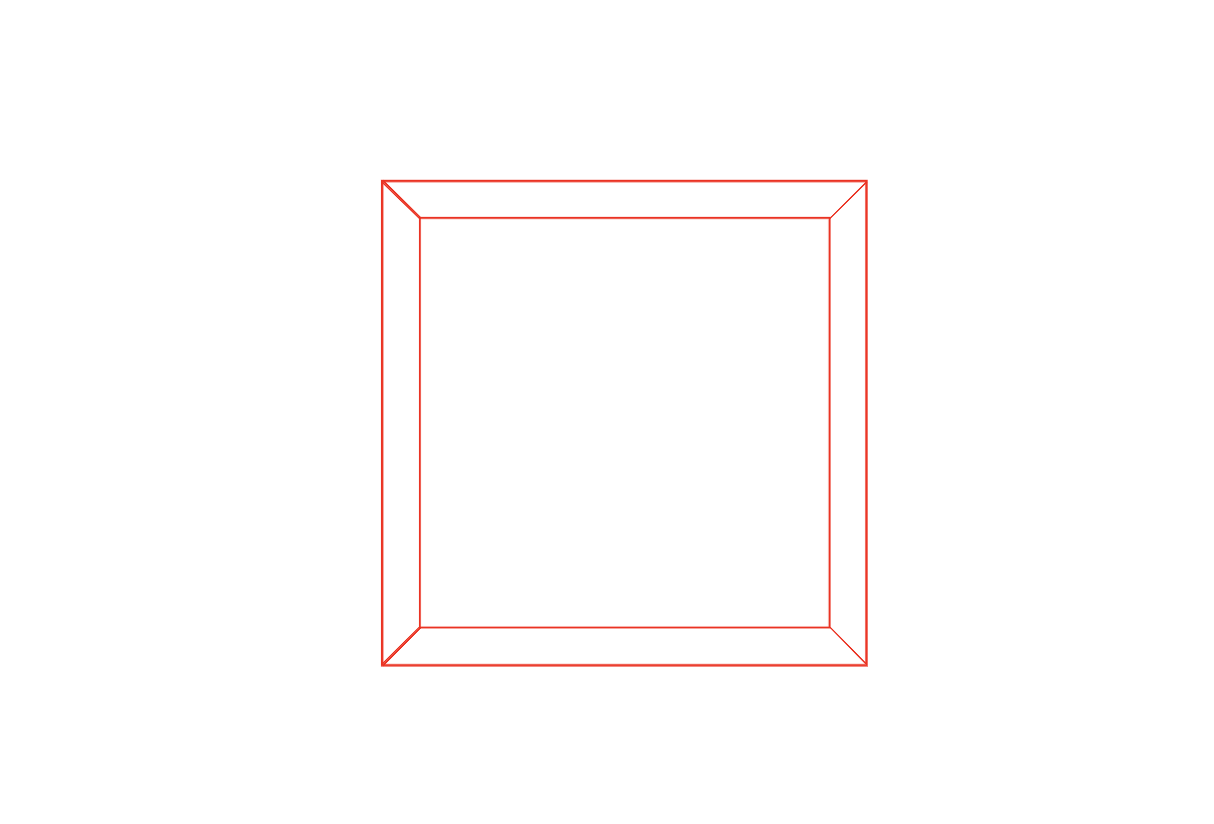
I started by creating an element with the 6 sides as child elements.
To make sure the elements are transformed correctly when rotating the parent element. I set the transform-style of the parent to preserve-3d.
Then I set a size on all the elements, then rotated and moved them into the shape of a cube. I set the perspective property to 6 times to cube’s size.
While working on it, I set a background for each of the sides and rotated the cube a bit to make sure the faces where correctly orientated.
.cube {
  transform-style: preserve-3d;
  position: relative;
  font-size: 200px;
  perspective: 6em;
  transform: rotate3d(1, 1, 1, 45deg);

  &, .side {
    width: 1em;
    height: 1em;
  }

  .side {
    position: absolute;
    top: 0;
    right: 0;
    border: 1px solid red;

    &.front { transform: translateZ(.5em); }
    &.back { transform: translateZ(-.5em) rotateY(180deg); }
    &.left { transform: rotateY(-90deg) translateZ(.5em); }
    &.right { transform: rotateY(90deg) translateZ(.5em); }
    &.top { transform: rotateX(90deg) translateZ(.5em); }
    &.bottom { transform: rotateX(-90deg) translateZ(.5em); }
  }
}
I ended up with a cube that looks like this;
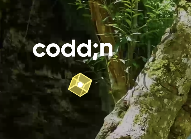
I gave the sides a little styling and added a "light" to the center.
.cursor {
  position: relative;
  font-size: 40px;
  width: 1em;
  height: 1em;

  &:after {
    content: "";
    background: #fff;
    box-shadow: 0 0 10px white;
    border-radius: 50%;
    position: absolute;
    top: 50%;
    left: 50%;
    transform: translate(-50%, -50%);
    width: 10px;
    height: 10px;
  }

  .cube {
    .side {
      background-color: transparentize(yellow, 0.5);
      border: 1px solid yellow;
    }
  }
}